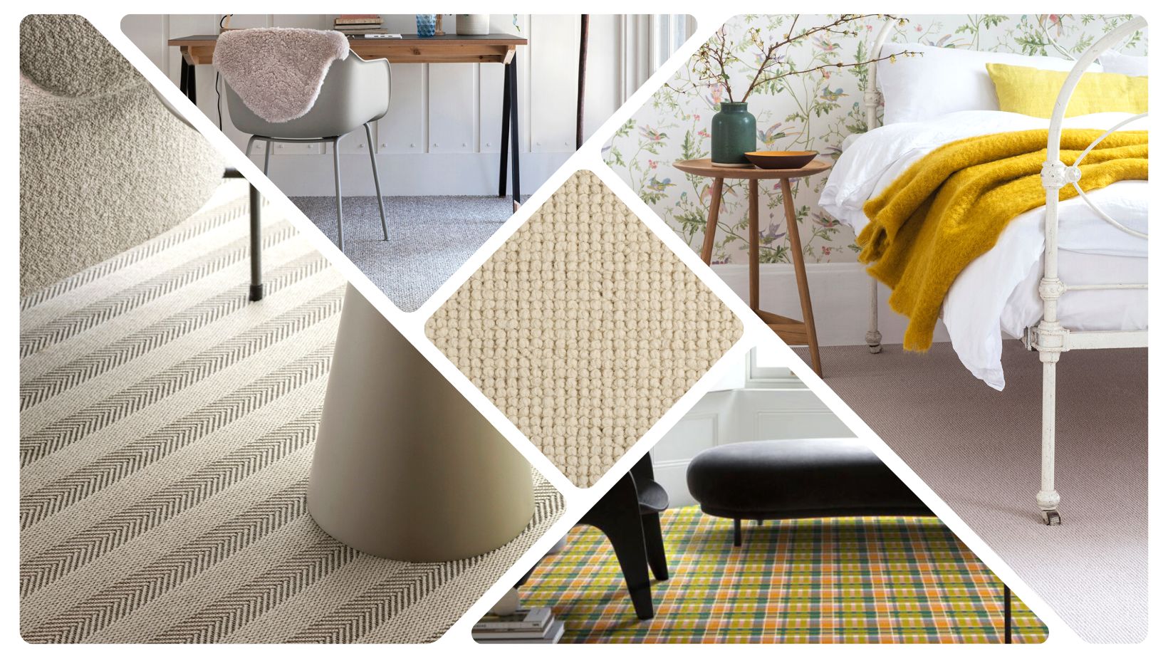
Alternative Wool Iconic Herringstripe Behrs, Sisal Metallics, Wool Milkshake Raspberry, Quirky Tartan Tam O’Shanter and Wool Pebble Omaha
We want to tell you about the new paint shades being announced now for 2023. We want to talk colour and carpet and get ahead of the trends.
This time of year, a craze of colours appears as the big paint brands predict what our walls will be wearing for 2023. Forecasts like our weather are mixed but we see with earthy greens, moody reds, and golden neutrals on the home horizon.
WILD WONDER • Dulux’s Colour of the Year 2023
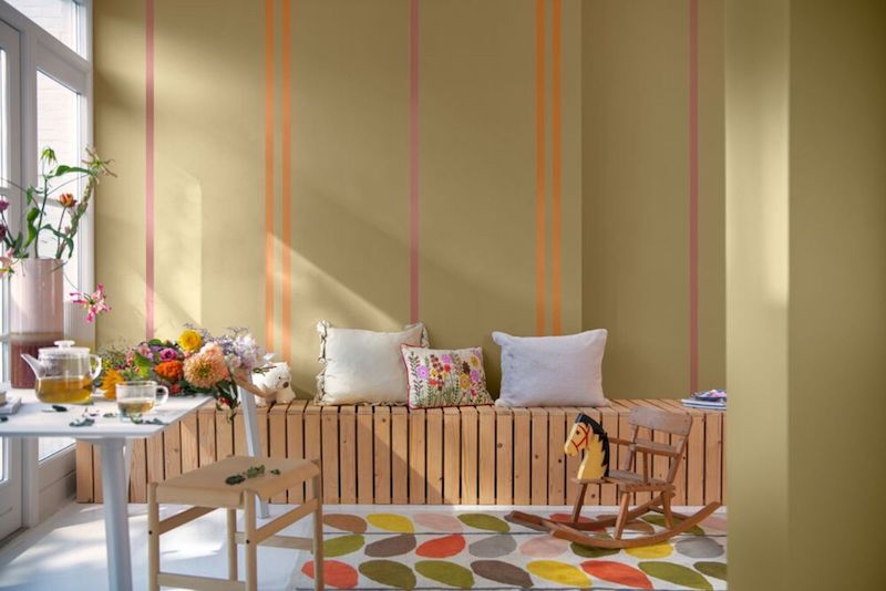
Photo Dulux
Dulux describes this pale yellow as “a soft gold with hints of green.” It makes sense as back to nature green is here to stay, and we have noticed gold creeping indoors. How to use this pale yellow in our interiors.
“As people search for support, connection, inspiration, and balance in the world today, they’re diving into the wonders of the natural world to find it. Wild Wonder is a positive, natural tone that, by connecting us with the natural world, can help us feel better in our homes.”
The optimistic hue, reminiscent of “fresh seed pods and harvest grain”, brightens up living spaces and goes well with greens – the new neutral going against crisp whites of decades past. Wild Wonder can also be used to create a homely feel with dusky pinks and soft reds. Or go for a harmonious tone and tone scheme.
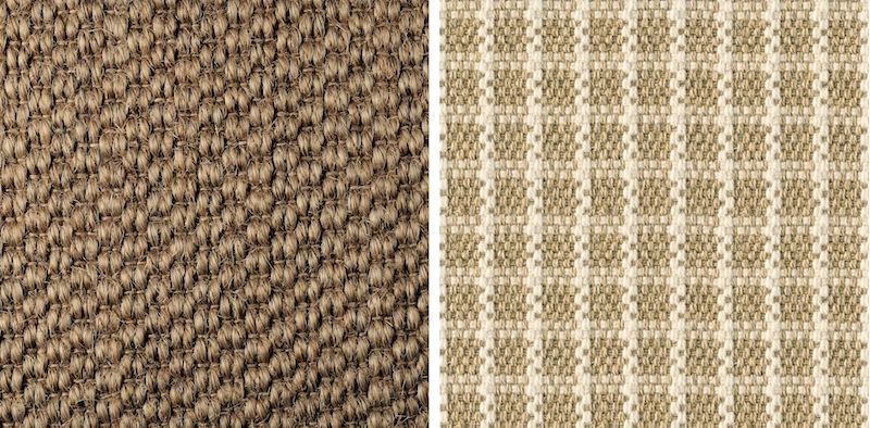
Alternative Sisal Bubbleweave Honey is big on natural texture and Woosie Check Wild a warm mix of sisal and wool in warmer neutrals
BEVERLEY • Farrow & Ball
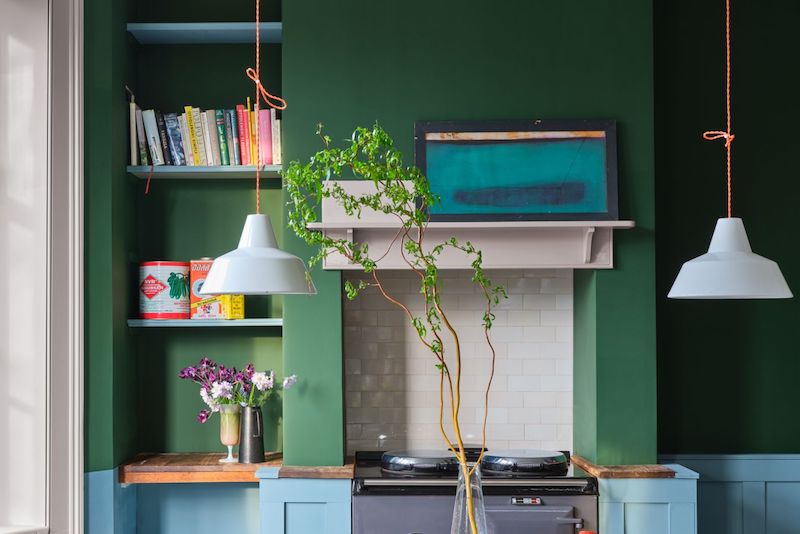
Greens keep turning over a new leaf. This time it’s Farrow & Balls turn with Beverley, a clean mid green shade that connects us once again with nature – think the greenery of forests and foliage.
Charlotte Crosby, head of creative comments “Beverly is reassuring, uncomplicated, and full of depth. ” It an easy shade that works with earthy tones of natural fibres such as undyed wools and flax. Blue complements green well too.
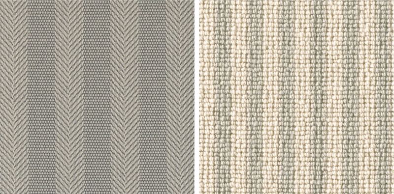
Alternative Wool Iconic Herringstripe in Behrs, a gentle natural shade with hints of green Wool Rhythm Otis
ALIZARIN • Graham & Brown
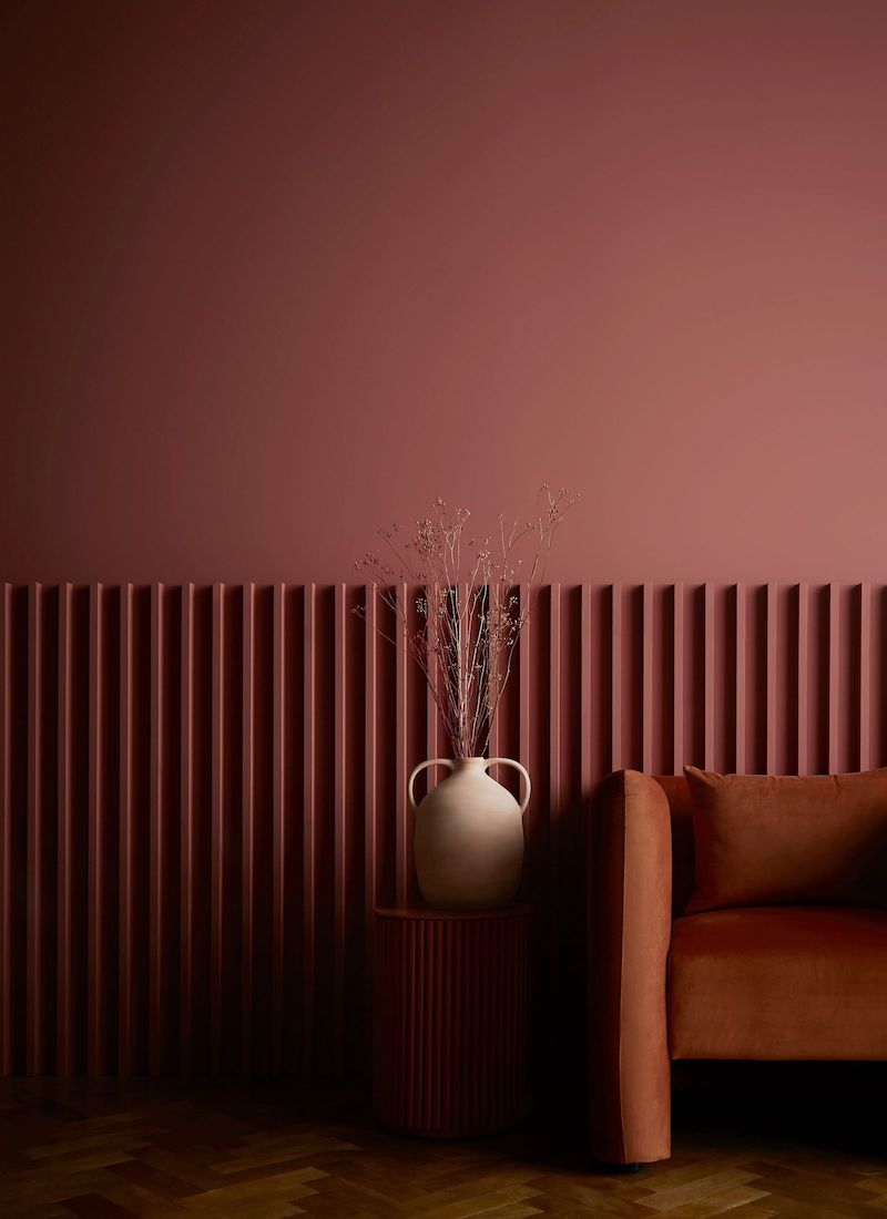
Photo Graham & Brown
British paint brand Graham & Brown pick a shade also rooted in nature but this time it’s an earthy warm auburn red shade named after a pigment derived from the Rubia plant species, historically been used as natural dye.
Maryanne Cartwright, Head of Design comments,” This deep and moody hue embodies the best russet reds and spicy terracotta shades, highlighting the beauty found in natural earthy tones. In the studio we enable this by seeing the beauty in items that would be discarded and making them shine again, creating a bespoke and special object.’
Alternative Wool Pebble Omaha, for a comfort with a touch of luxury and Quirky Tartan Tam O’Shanter for a richer pattern
BENGAL YELLOW • Graphenstone
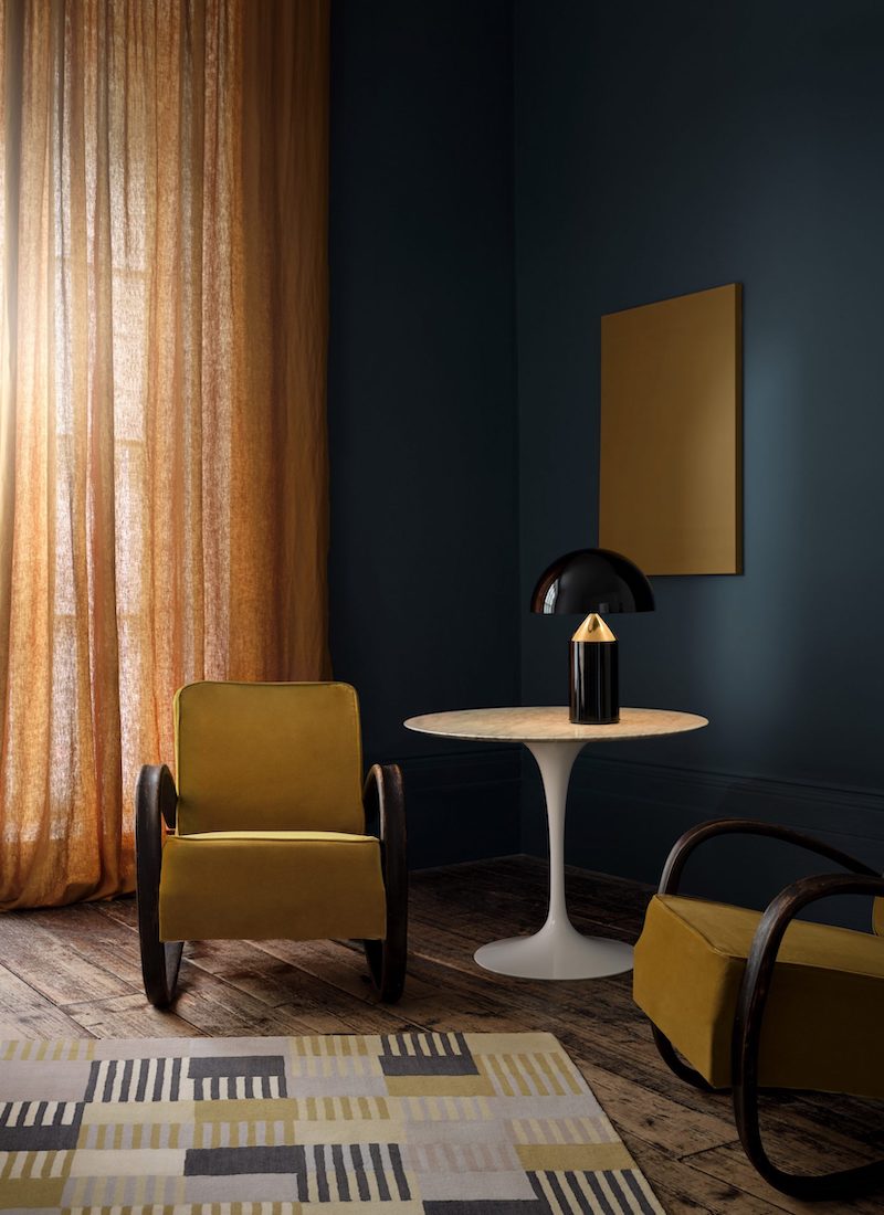
Photo Graphenstone
This curated a colour palette featuring rich reds and deep greens and warm yellows informed by natural dyes to guide us through the winter months of 2023. Colour consultant Betsy Smith says that “This edit of colours will glisten gloriously in a winter ray of sunshine or flickering candlelight.” We love this golden mustardy yellow paired with Indigo Blue.
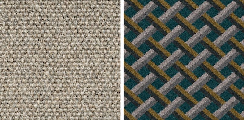
Make Me A Rug with a textured Sisal Metallic accented by a Herringbone Midnight Blue border or an Ochre yellow cotton border. Or a wall-to-wall carpet in Quirky Lattice by Ben Pentreath for Alternative.
We will finish with a flurry…
RASPBERRY BLUSH • Benjamin Moore
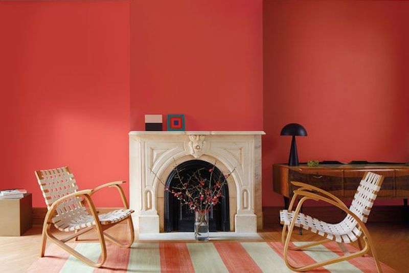
Photo Benjamin Moore
We like to see what our friends across the pond are up to. It seems that our American friends are ready to bring colour back into the home, taking a step outside their colour comfort zones. This rosy coral certainly packs a saturated punch and perhaps the sensitive Brits will balance these statement shades with softer naturals.
Helen Shaw, director comment, “the time is right to take a confident step forward with our colour selections to truly embrace the transformative power of colour and paint.
“Raspberry Blush is the kind of colour that takes centre stage and wants to be noticed. Taking the plunge into deep, saturated, or chromatic colours can be daunting, especially when we’ve become so comfortable with all-neutral spaces. For some, bringing a saturated colour into the home may be done in a small gesture of colour, while for others the time has come to make a fearless colour statement.”
Alternative Wool Croft Arran, a softer natural wool carpet will balance this colour beautifully. Wool Milkshake Raspberry is our choice too!
PANTONE
![]()
The most talked about colour of the year is from Pantone.
Since 2000 Pantone Colour Institute™ has announced a Colour of the Year, the selection process has involved careful trend analysis and thoughtful consideration, looking at multiple colour influences from technology to art, films to the natural world and its impact across the globe.
Pantone colour of the year is announced later this month. Thursday 1 December be exact.
What are your predictions?
See more of Alternative’s Wool Collections.
Go online to learn more.
www.alternativeflooring.com

